Objective:
Created:
October 2015 | 4 weeks duration
Tools:
Excel, Illustrator, Aftereffects, Photoshop
Reason:
Wanted to make an exploratory visualisation
from narrative events
Data:
While exploring on the topics which have been seen as the social stigma, for example, depression, I stumbled upon this club which consists of musicians and artists who died at the age of 27. This unique age captured my attention and I started exploring more on the topic.
The 27 Club is a term that refers to a number of popular musicians who died at age 27, often as a result of drug and alcohol abuse, or violent means such as homicide or suicide. The number of musicians who have died at this age and the circumstances of many of those deaths has given rise to the idea that premature deaths at this age are unusually common. There have been many different speculations about the causes of such early deaths and their possible connections. Although humans die regularly at all ages, there is a statistical spike for musicians who die at 27.
Project Description
Project Details
Guides:
Chakradhar Saswade, Dr. Aneesha Sharma
The main challenge was to highlight the two contrast sides of the lives of these famous artists, glorified yet short-lived. The main goal of this visualization is to make users find their own stories through data and also to create awareness among a large user base.
Approach taken:
An exploratory interactive visualization with a drill down story approach was adopted. Most importantly, the graphics are chosen so as to have a connection with the narrative so as to build more empathy among the user.
Process Followed
Data Mapping
Moodboard
Some of the images in the similar theme collected and arranged to give a better understanding of the visual language for the visualization.
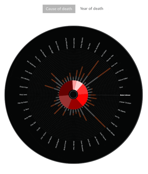
The data types available for this visualization are causes of death, year of death, genre types, artist types, track records and artists. Except for the number of track records, rest all are categorical (or qualitative) data. The visual encoding for these data types is not the usual styles but has a more metaphorical approach.


Genre of narrative visualization
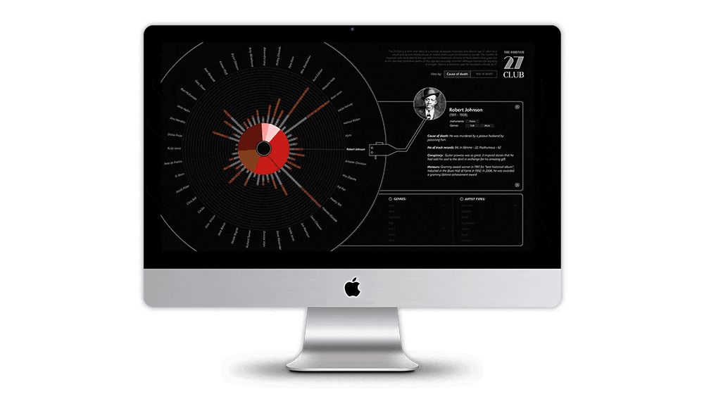
For this visualization, I followed a partitioned poster style with single frame interactivity approach after the user clicks on the introduction page. The page is divided into two sections: one section has the vinyl disc and the other one is the panel of the gramophone and summary of the visualization.


Visual explorations
The visual platform of the narration is very consistent even though there is no proper ordering of events. The color schemes chosen are according to the vinyl disc and consistent across all the pages. Various other timeline designs such as a linear flow diagram, vertical flow diagram etc. were tried to fit these data. But in the end, the metaphorical approach used for the visualization with the stories about the artists was given more importance as it built more empathy.

Narrative Structure
A narrative is communicated clearly through the interaction of the text in the left section with the annotation and graphic elements in the right panel enriching through multi-messaging. Panel on the right displays the names of the artists in bold with the genre, instruments played as sub-heading making the vast quantity of information with memorable factoids. This is followed by the brief description of the death and glory of the artists. In order to make the visualization more informative and interactive, the genre and artist types are provided in the form of a checklist where the user can play around and find their own insights.
Final Outcome
This is the landing screen of this visualization which loads with the disc rotating by default and listing the details of the artists of the right panel as and when they are aligned to the header. The continuous rotation of the disc acts as a starting point for the personal experience of the data and also provides the tacit tutorial for the user.

Interaction using Filters
In this the data is not presented all at once but is constructed in a hierarchical manner with the use of annotation and animations. On selection of any filter, the artist's names are accordingly displayed on the disc. On hover, it displays the cause or year of the death.