UX Research + Design

The Forever 27 Club: data as empathy

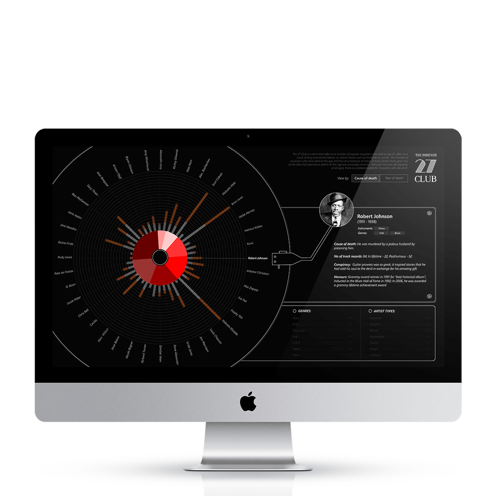
An exploratory visualization that used metaphor and interaction to turn a dataset of musicians' early deaths into a reflective, awareness-building experience — letting people find their own stories.

My role
Researcher & Designer
Timeline
2015 · 4 wk
Org
NID
Methods
Exploratory data viz, metaphor design, prototype
This project touches a sensitive topic — substance use and early death. It was designed to build empathy and awareness, not to sensationalize.
The problem

Statistics about musicians who died at 27 (often tied to substance use and other hard causes) are easy to scroll past — the human weight gets lost in the numbers.

Research question

How can an exploratory visualization make people feel the human story behind the data, and surface their own insights rather than being told a single conclusion?

Outcome

A metaphor-driven, interactive 'vinyl' visualization that builds empathy and lets users explore by cause, year, and genre — turning a dataset into reflection.

The design problem

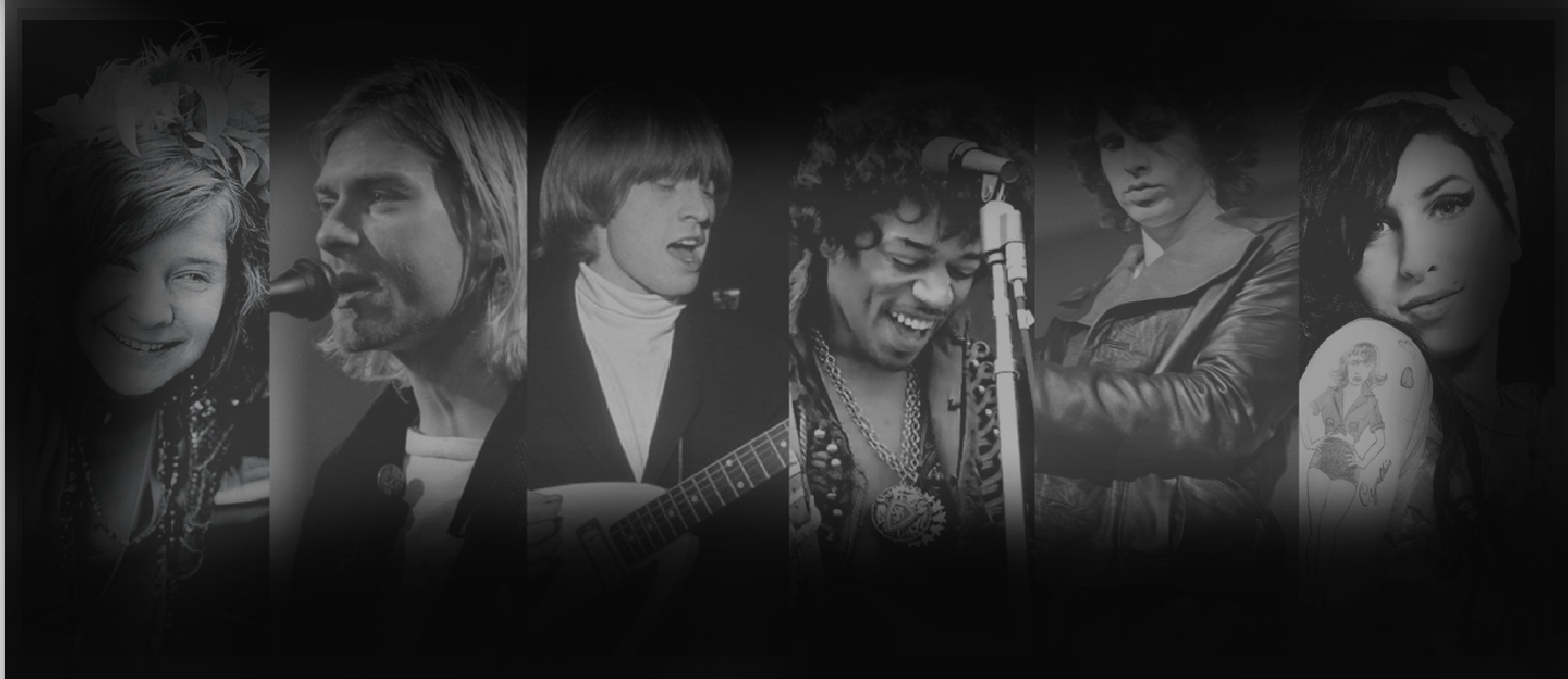
While exploring socially-stigmatized topics like depression, I found the '27 Club' — a statistical spike of musicians dying at that age. The challenge was holding two truths at once: glorified, yet tragically short-lived.

Rather than the usual encodings, I chose a metaphorical visual language — a rotating vinyl record and gramophone panel — so the form itself carried the subject's emotional weight.

Research judgment

Why exploratory + metaphor over a standard chart

Method I chose

A partitioned-poster, reader-driven interactive with metaphorical encoding and drill-down

For mostly categorical data (cause, year, genre, instrument) where the goal is empathy and personal discovery, a conventional chart would inform but not move anyone. Metaphor plus reader-driven filtering invites people to find their own stories — the emotional point of the piece.

Constraints I balanced: Four weeks, solo; I prototyped several timeline forms (linear, vertical flow) and deliberately rejected the 'correct' ones because they didn't build empathy.

Alternatives I considered
A timeline / bar chart
Why not: Accurate and quick to read, but emotionally inert — it would inform without creating the reflection the topic demands.
A fully author-driven story
Why not: Would impose one reading; the goal was personal discovery, so reader-driven exploration fit better.
What we learned

Design insights

01
Metaphor carried meaning encoding couldn't
Evidence: The vinyl/gramophone form tied the visualization to the subject, building empathy that abstract marks didn't.
02
Reader-driven exploration deepened engagement
Evidence: Letting users re-arrange by cause or year, with hover details, shifted them from passive viewers to active interpreters.
03
Authoring is hidden labor in 'open' tools
Evidence: A reader-driven piece still required heavy authoring — deciding possible interactions, which stories to include, and how much detail each holds.
From the project

The visualization

Vinyl-record interface — the landing view.
Visual exploration and metaphor development.
Concept framing for the piece.
Impact over activity

Outcome

  • Recognized as part of Suchi's data-storytelling body of work shown at international venues.
  • A model for affective, empathy-first visualization of sensitive data.
  • Demonstrates matching form to intent — exploration and emotion over efficiency.
  • Ends open-ended, inviting reflection and awareness rather than a closed conclusion.
If I did it again

Reflection & self-critique

What I'd change: I'd test the empathy goal explicitly — does the metaphor actually move people more than a control chart? I assumed it; I'd measure it.

What I'd keep: Choosing metaphor over the 'correct' timeline. For an affective goal, the conventional answer was the wrong one.

What I learned: 'Let the user explore' is never free — reader-driven design is some of the most authored work there is.

Watch

Video prototype