UX Research + Design

Redesigning e-consultation for India's largest health platform

Mixed-methods research across patients and doctors that reframed a fragmented online-consultation experience — shipping features that are still in 1mg's apps today and grew consultation revenue.

My role
UX Researcher & Designer
Timeline
2017–18 · 1 yr
Org
1mg (now Tata 1mg)
Methods
80 interviews, 52 surveys, 20 contextual inquiries, guerrilla usability
The problem

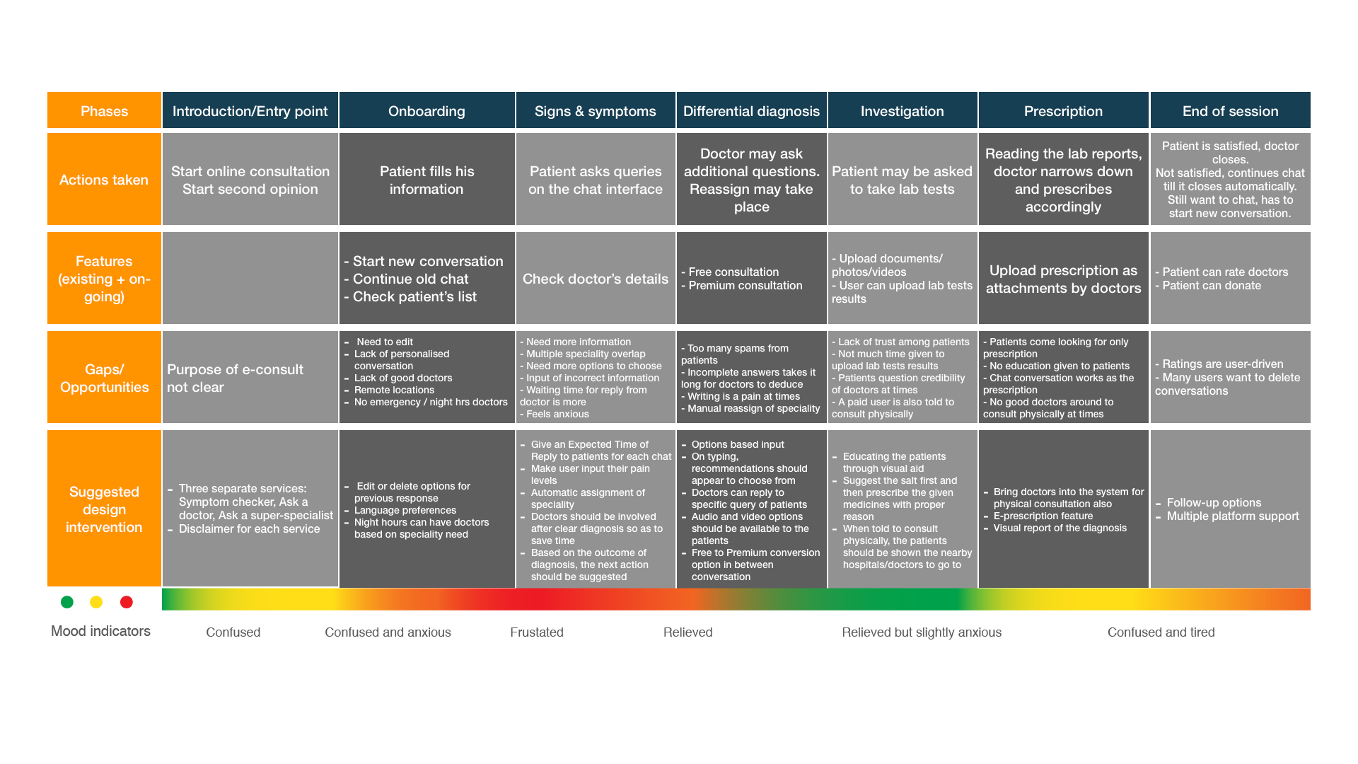
1mg's 'Ask a Doctor' consult was a dead end — a patient couldn't act on a consultation (e.g., buy prescribed medicine or book labs), so the care journey broke and the business left revenue on the table.

Research question

Where does the online-consultation experience break down for patients and doctors, and how do we connect it into one seamless care journey?

Outcome

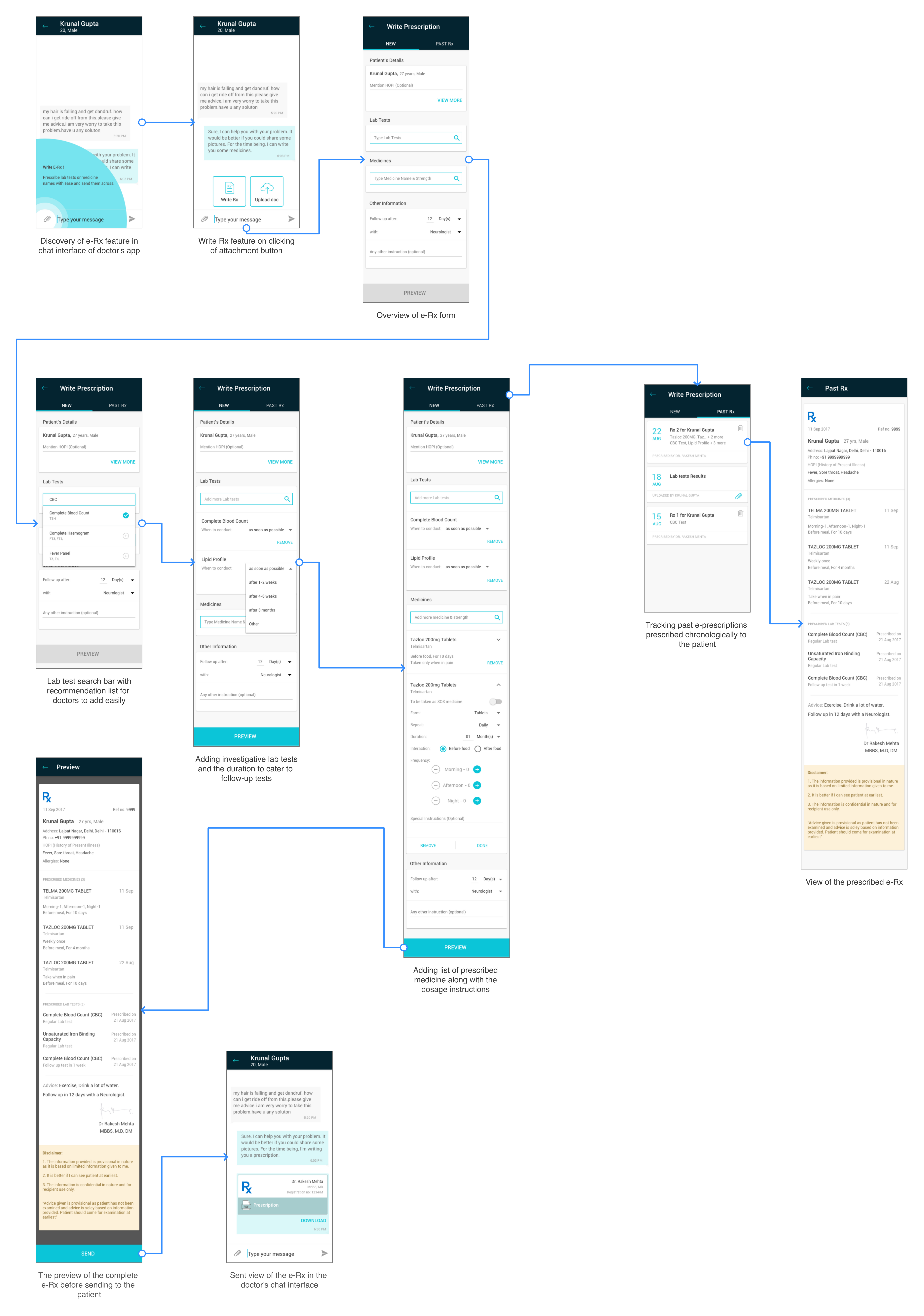
Shipped a redesigned consult + e-prescription flow (live across Android/iOS/web since Nov 2018) that grew usage and consultation revenue with positive doctor feedback.

The business problem

Online consultation was fragmented: patients consulted, then fell off because they couldn't fill prescriptions or book the labs the doctor recommended. Doctors, meanwhile, found issuing a usable digital prescription slow and error-prone. Every broken handoff was both a care failure and lost cross-sell into 1mg's pharmacy and labs.

I framed the work around the whole ecosystem — patient and doctor — because the revenue was trapped in the seams between consult, pharmacy, and labs.

Research judgment

Why a layered mixed-methods approach

Method I chose

Double-diamond research: 80 user interviews + 52 surveys + 20 in-context inquiries, synthesized via affinity mapping into 11 personas

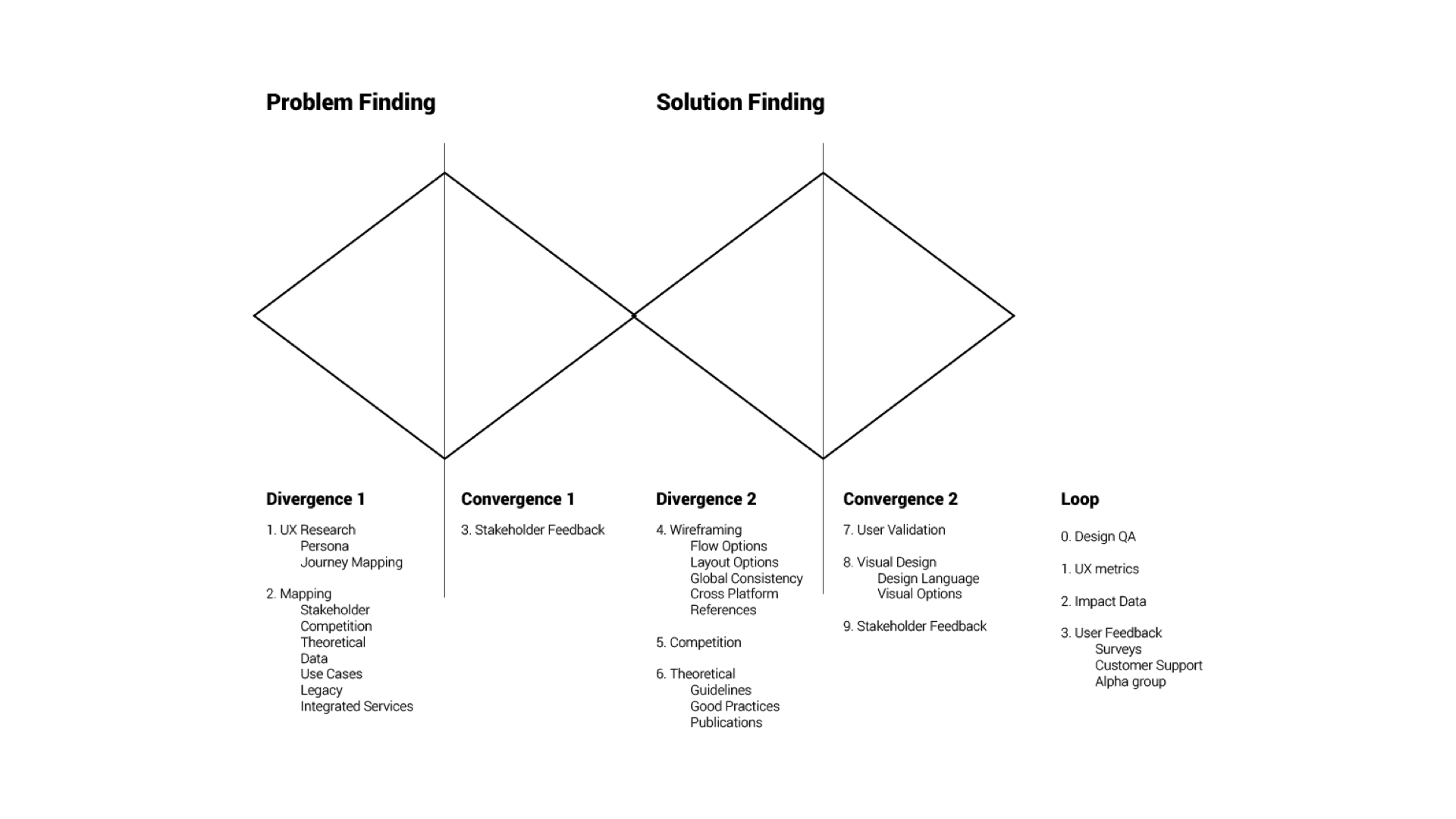
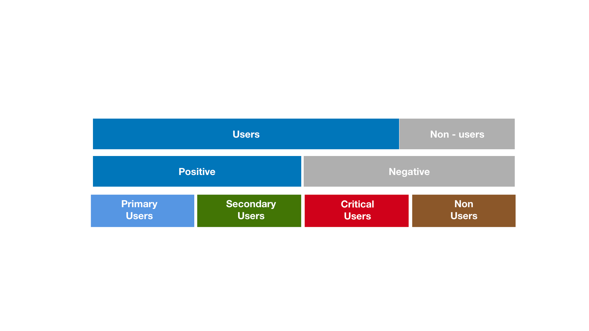
Different questions needed different tools: customer-call interviews (n=80) mapped existing users; social surveys (n=52) reached non-users for unbiased signal; contextual inquiry in clinics (n=20) caught behavior people don't self-report. Triangulating the three is what made the segmentation trustworthy.

Constraints I balanced: On a product timeline, I sequenced broad-and-cheap (calls, surveys) before deep-and-costly (in-clinic visits), letting early signal target where field time was worth spending.

Alternatives I considered
Analytics + A/B only
Why not: Could optimize the existing flow but never reveal the missing flow (act-on-consultation) users couldn't even attempt.
Interviews with users only
Why not: Would miss non-users and doctors — both essential to a two-sided ecosystem fix.
Lab-based usability testing
Why not: Wrong setting for the target group; I later ran usability in the field instead (see below).
What we learned

Key insights

01
The journey broke after the consult, not during it
Evidence: Journey mapping showed the sharp drop-off was the inability to act on advice — buy meds, book labs — not the conversation itself.
02
Doctors were a blocked stakeholder, not just a supply
Evidence: Issuing an e-prescription in chat was slow and confusing, so doctors avoided it — starving the very feature that would complete the loop.
03
Elderly, non-tech users were the real stress test
Evidence: Guerrilla usability in public parks found choice overload, a need for step-by-step guidance, and distrust of icon-only doctor avatars (they wanted real faces).
From the project

Research → design

Double-diamond problem framing across the consult ecosystem.
User segmentation synthesized into 11 personas.
Patient journey map — locating where the experience broke.
Doctor-side e-prescription flow (final design).
Impact over activity

What shipped and what changed

  • Live in production since Nov 2018 across Android, iOS, and web — e-prescription, redesigned consult landing, and service detail flows.
  • Cross-integrated consult with pharmacy and labs, closing the broken care loop and unlocking cross-sell.
  • Reported growth in consultation usage and revenue with positive doctor feedback.
  • Usability findings (simpler navigation, step descriptions, real doctor photos) folded directly into the shipped UI.
If I did it again

Reflection & self-critique

What I'd change: I'd instrument the redesign with clearer success metrics up front so impact was measured precisely, not just reported directionally.

What I'd keep: Guerrilla testing with the hardest users (elderly non-users) in their real environment — it caught trust and accessibility issues a lab never would.

What I learned: In a two-sided product, you can't fix one side; the doctor's friction was silently capping the patient experience.